

As many already know, the best part about the iPhone X is its variation from the previous models. Supporting third-party applications and many new features such as the TrueDepth sensor and Augmented Reality, it encourages app developers and designers to come up with innovative applications. Besides, it gives iPhone X users a chance to experience something different than usual.
The iPhone X is the biggest update to the iPhone in a long time. It has a new screen form and a greater resolution. Moreover, after almost 10 years, the home button is gone. Whereas, you’ll spot a change in the touch gestures. Each of those modifications has the potential to generate work for designers and app developers. And then, comes the most prominent addition, the notch.
Typically, iPhone launches a new feature in the market, and the next thing you see is others following the same path. So, you may also expect others, not just Apple, to work around the notch. But how do you navigate around it in your design? How difficult is it for app developers to create an app for it? Is it a poor design, as some critics claim? Some users dislike how the notch cuts into the display, while others value the extra visible space.
But, to get a better idea, we got in touch with some best mobile app developers/designers who had lately completed the process of updating their apps for iPhone X. We mostly reviewed how everyone in the business handled the shift to a new smartphone. Let’s begin to see how.
The Apps Created by Developers we Interviewed
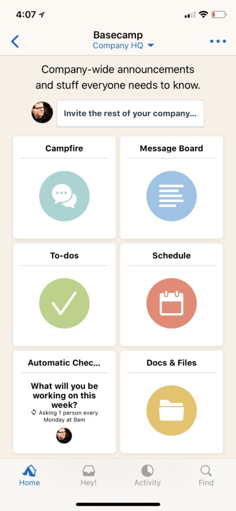
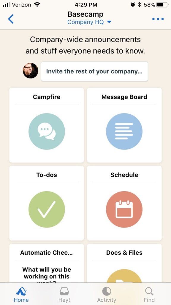
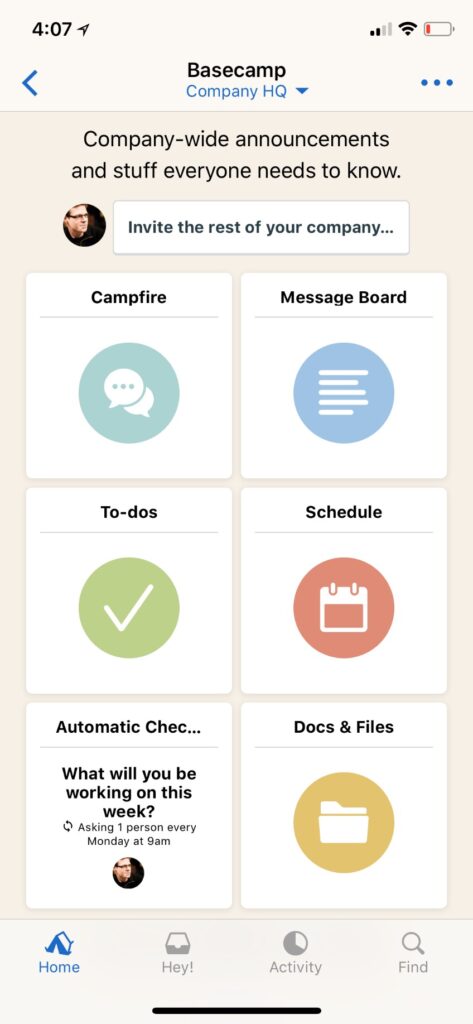
Basecamp app on the iPhone X.
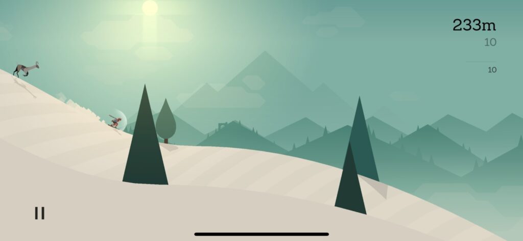
Alto’s Adventure game on the iPhone X.

Galley Foods app on the iPhone X.

Infltr app on the iPhone X.
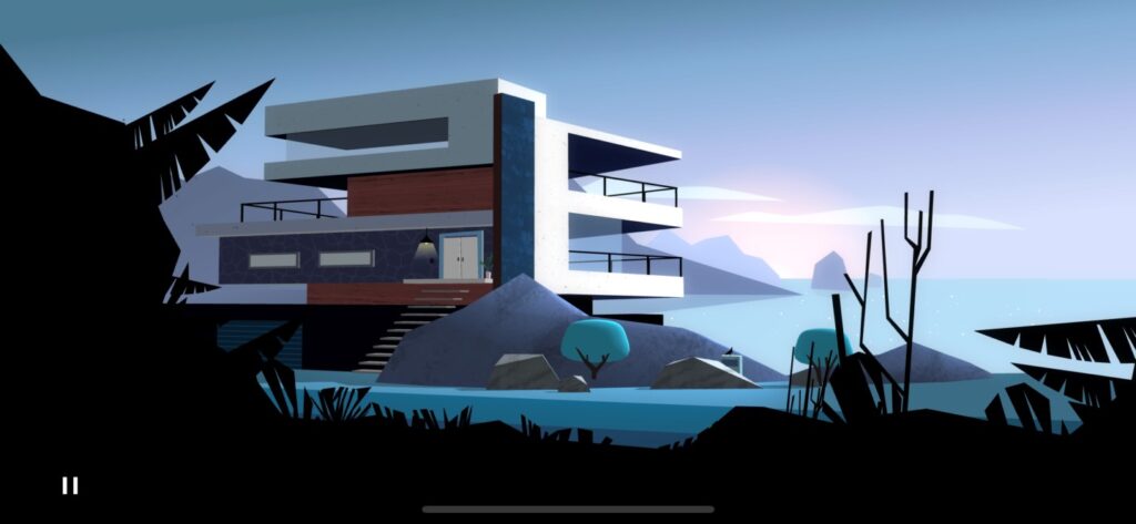
Agent A on the iPhone X.
An Increase in Resolution
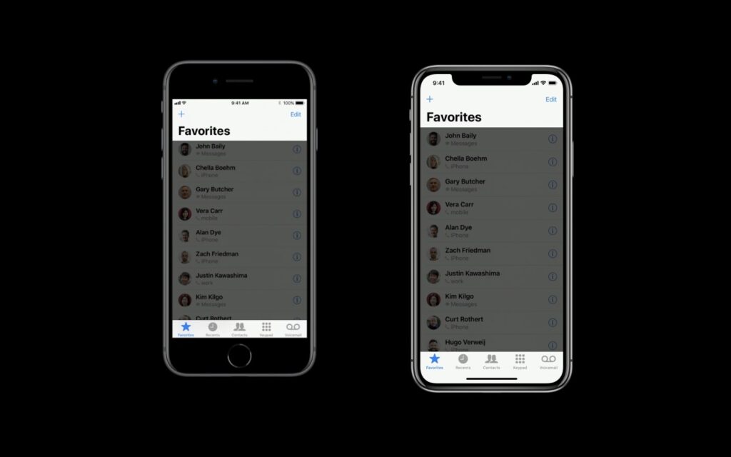
We’ll start with the changes and issues that a differently-sized screen brings. Also, how Apple suggests dealing with them. iOS app developers estimate their user interface in points, not pixels. Why? Because iOS operates on devices with different resolutions. So, the iPhone X’s screen is the same width (375 points) as the iPhone 7 and 8, but it is 145 points taller. Since it shares its width with ordinary iPhones rather than the Plus variants, iPhone X lacks the enlarged landscape mode.
Additionally, to look sharp on each device’s screen resolution, iOS apps must support displaying assets at several resolutions. The signifiers @1x, @2x, or @3x are used for the three tiers of resolution for assets. @3x is used on the iPhone X.
Most top app developers we spoke with feel that their assets look just how they want on the new iPhone screen. Phillippe Levieux, the co-founder of infltr, says that they use vector assets in PDFs for their photo editing app. Moreover, Yak & Co Art Director, Mark White also says that their assets’ transition for Agent A went smoothly.
The iPhone X – with rounded corners and a notch.
However, the iPhone’s resolution has changed before without causing a major event. The iPhone X introduces three new features that developers have never had to deal with before.
- Round corners
- The notch or sensor housing
- New UI indicator at the top
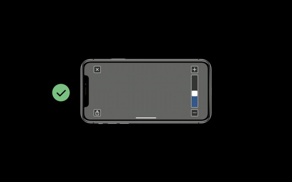
The Home Indicator
Previously, iPhones had the whole screen to themselves—other than the status bar and notifications. But, that’s not how it is anymore. Now, the notch sits at the top of the screen and the home indicator at the bottom. For previous iOS devices, Apple provides a set of guidelines and tools called Auto Layout to help iOS app developers avoid potential mistakes when employing blocked-off real estate.
As a result, app developers relying on Auto Layout rather than custom layouts transitioned to the iPhone X much more quickly and easily. As Chris Anderson, head of Galley Foods said that they only had to do minimal work to fit their app to the new dimensions.
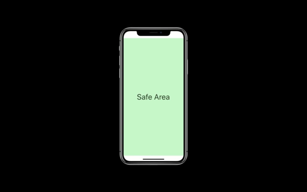
Apple’s Safe Area in iPhone X’s portrait mode.
Besides, Apple’s Auto Layout in iOS 11 describes a safe area. It includes tips on how developers should place their content to avoid common pitfalls. For the old models, the safe area was simple. But, with the iPhone X, it’s a bit complicated.
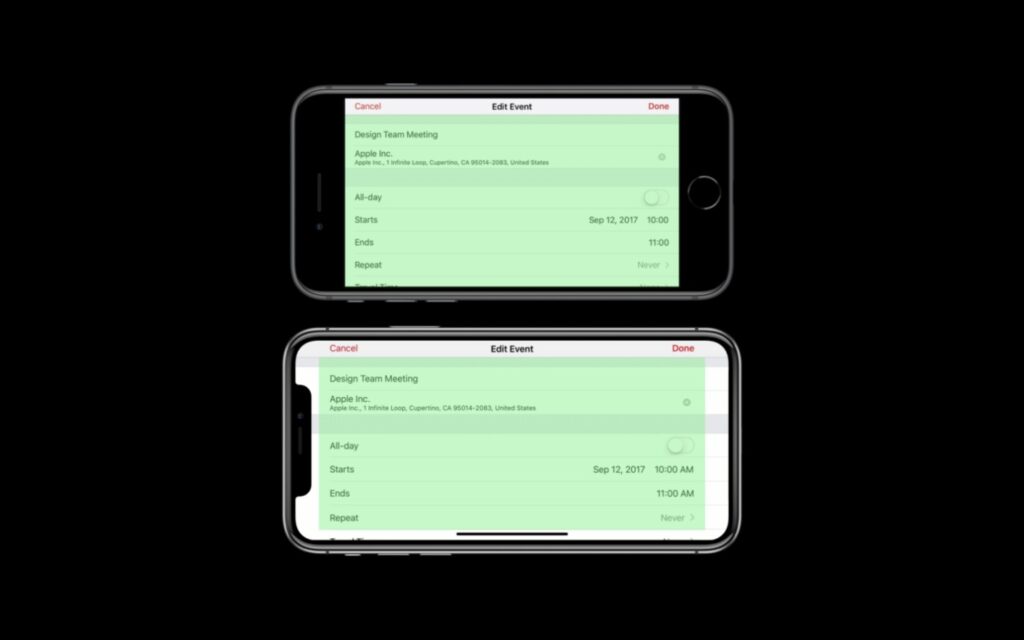
Comparison of Safe Area in the iPhone 8 and X.
The status bar stretches further down from the top in the iPhone X.
The Safe Area blocks part of the top and bottom of the vision in portrait mode. The status bar and sensor housing are located on the top, while the home indicator is located on the bottom.
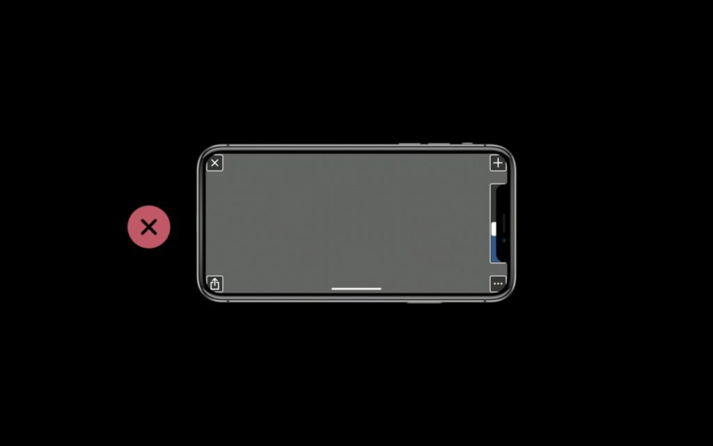
Where not to place UI elements.
Moving UI elements inside the Safe Area.
Designers or developers that place UI elements like navigation buttons at the bottom of the screen may need to reposition them if they were previously outside of the Safe Area. As Anderson of Galley Foods remarked that despite his relatively smooth transition, this was the ultimate problem he had with his app.
To end the discussion on the app layout, we discovered that the more developers followed Apple’s way of doing things, the easier was their transition.
The Notch or Sensor Housing
Next, app developers will have to deal with the cutout and the status bar at the top of the screen. The latter no longer adjusts its height in response to background operations like map services or incoming calls. It is, even so, higher than the previous one. Applications can still conceal the status bar and take up more screen real estate, but they’ll have to cope with rounded corners and, of course, a notch.
When we spoke with Basecamp designer Tara Mann, she said that the notch looks quite great with negative space around it. Sticking to the safe area and following Apple’s design instructions, the best app developers avoided the sensor housing.
Keeping in mind how critics call the notch a design flaw or poor idea, we asked designers how they feel about it. Sharing his thoughts, Cash said that this is a fine design compromise to incorporate the face ID. Whereas Tara Mann, also says that the presence of the notch doesn’t hinder her use of the iPhone X. To sum it up, despite the negative reviews, the notch didn’t bother many of the designers we spoke to.
Managing the Shift in the Aspect Ratio
Apple does not want apps to feature black bars in letterboxes or pillar boxes. Except for some video content where you cannot alter it. But how do apps built for the iPhone X display on the iPhone 8 and vice versa?
Background materials automatically extend to fill the screen when developers utilize Apple’s standard UI tools.
And yet again, if developers stick to the Auto Layout guidelines, apps will be much easier to update. Background material is frequently stretched at the top and bottom, dependent on the visual style already in place. Any buttons at the bottom are immediately moved above that extension and clear of the home indicator.
But what if the app uses background graphics?
- For iPhone 8, the background graphics will be cropped from the left and right if they’re built to fill. Or, moved to the top if they’re built to fit
- For iPhone X, the assets will be cut out at the top and bottom. Even worse, pillar boxed. On iPhone 8, this would result in black bars on both sides of the app.
The Basecamp app in the iPhone 7’s aspect ratio.
The Basecamp app in the iPhone X’s aspect ratio.
Both scenarios present a poor user experience. Here, the designers had to work on fitting in the large screen. The games and apps that didn’t fit the iPhone screen had to be modified. Thus, Apple recommends app developers draft images that would survive the cutdown.
OLED and HDR
The iPhone X incorporates an OLED display. It has better contrast and greater visuals. Thus, app developers and designers didn’t have much to do to make their apps look great on the iPhone X screen. Moreover, we think that Alto’s Adventure game looks much better on the iPhone X than on the iPhone 7 or 8.
Cash, the video game’s developer, said that their team didn’t put in any extra effort for the iPhone X transition. Instead, the edge-to-edge screen and stunning visuals are what improved their game’s outlook.
How Do Apple prepares Developers and Designers?
New updates in the iOS application come and go. So, how does Apple prepare iOS and android app developers to keep up with the changes? If that’s what you’re thinking, you’ll get the answer here. Every year during the summer, Apple instructs developers/designers about important considerations at the Worldwide Developers Conference (WWDC).
Previously, Apple came up with some ideas crucial for the iPhone X, for instance, the safe area. Whereas, this year Apple released video tutorials just after the launch of the iPhone X. The tutorials cover all the information that designers may need for a smooth transition.
Mann claims that those Apple resources were useful to her and other Basecamp developers. On the other hand, Phillippe Levieux also added that the video tutorials and documentation were great, to begin with. To put your plans into action, ensure to find only the best app developers near me.
To Sum Up
Lastly, this transition to the iPhone X could have been the most difficult. But it looks like Apple did a great job preparing app developers and designers. At the WWDC, they gave some practical solutions. And, only a few things were left to be figured out after the launch of the iPhone X.
And now comes the designers’ and developers’ view about the iPhone X and the notch. Not many had issues with the notch. The transition was quite smooth for almost everyone. The notch compromise is unlikely to be the last. So, it’s past time for you to get used to it!